Saturday, March 29, 2008

Fresh and Modern Canadian Pad


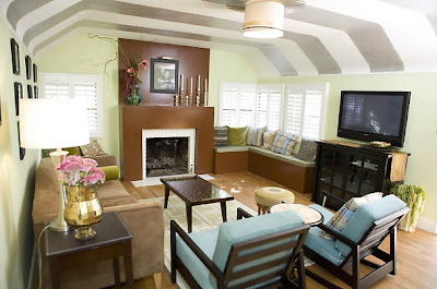
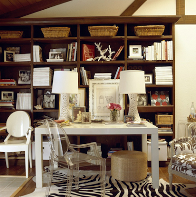
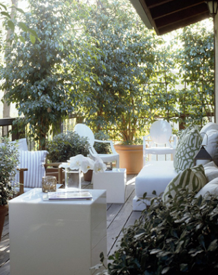
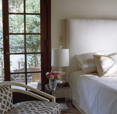
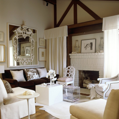
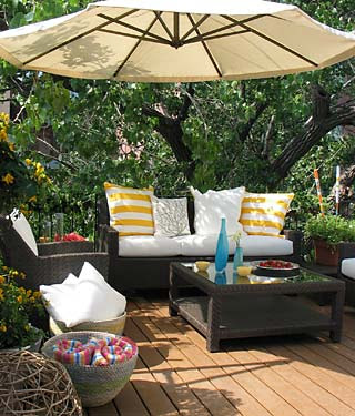
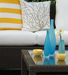
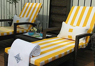
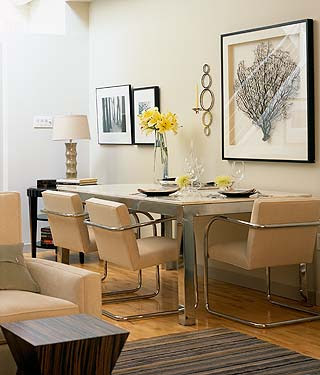
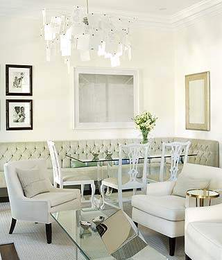
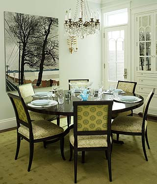
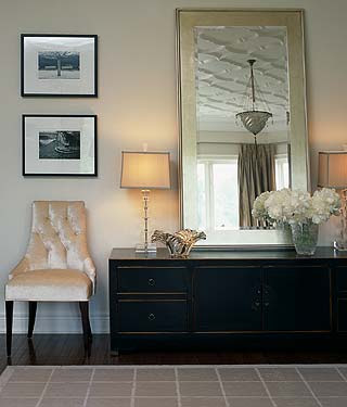
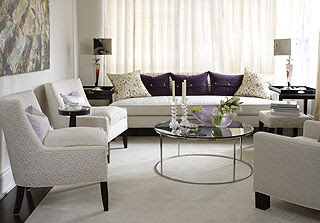
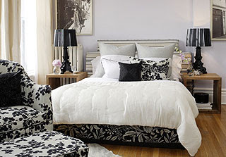
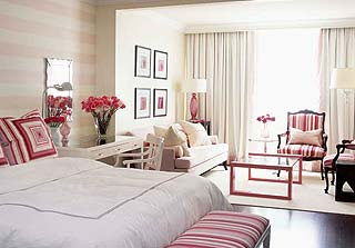
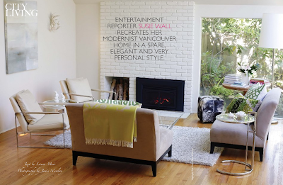
Here is a little preview of Susie Wall's chic pad in the April issue of Canadian House and Home. I like that it's very modern and clean with a little touch of glamour in those imperial trellis pillows.
Friday, March 28, 2008

Asha by ADM Jeweled Clutches


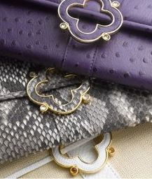
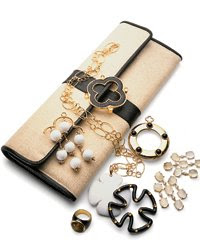
Ashley Dodgen-McCormick has a fabulous jewelry line called Asha by ADM. I pretty much love every single piece of her collection. Her rings and necklaces are to die for! She recently created a line of jeweled clutches and based on the preview pictures above, I can't wait to see them in person! So elegant and chic!!!
Thursday, March 27, 2008

Russell & Hazel Love


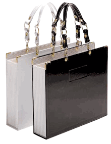
I get weirdly excited about organizing and I especially love organizing products. I was so bummed when the store Hold Everything went out of business. It was like an organizing freak's dream! Another company that I love isRussell & Hazel. I especially love the chic and stylish Audrey Tote. Forget manila folders! Carrying files has never been so fashionable.
Wednesday, March 26, 2008

I Know Where I Am Taking My Next Vacation!

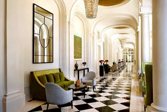
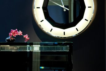
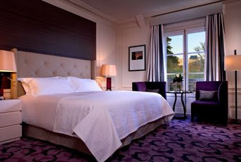
Although I have been to Paris several times, I have yet to visit Versailles. This has always been a huge regret of mine and I have resolved that I am going to visit Versailles the next time I am in Paris no matter what, and I know exactly where I am going to stay. Check out these amazing photos of the Trianon Palace & Spa, located just steps away from Versailles. Apparently it was designed by René Sergent, who also designed the fabulous Plaza Athénée Hotel in Paris. It looks like pure heaven to me!


Tuesday, March 25, 2008

Bid and Lost :(


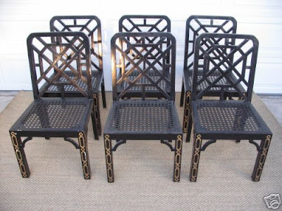
I just spent the last week stalking these fabulous Billy Haines Dining Chairs on Ebay but unfortunately I lost out on the bidding. Apparently I wasn't the only one who lost out because the reserve price was not met. Now no one will have the opportunity to add these gorgeous pieces of work to their home.
Saturday, March 22, 2008

More Than Just Inspiration?

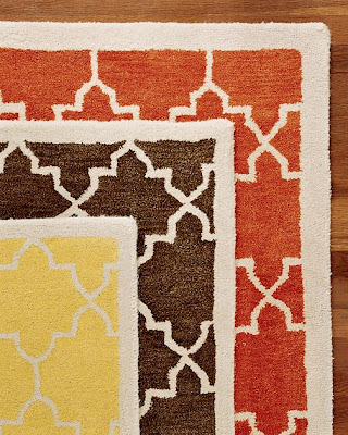
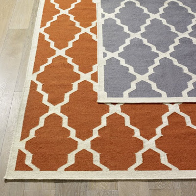
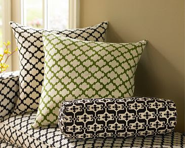
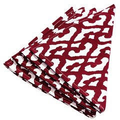
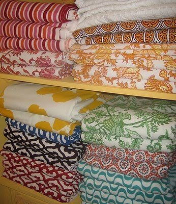
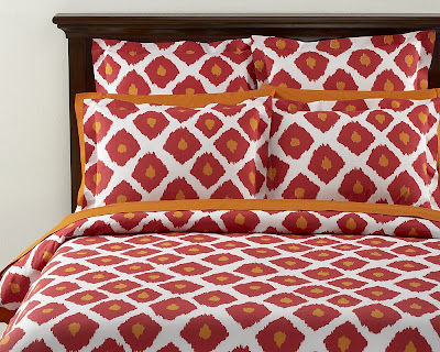
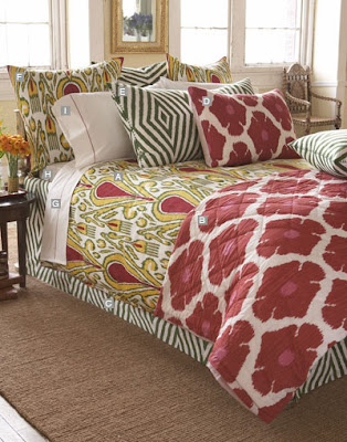
I opened up the latest Pottery Barn Catalogue today and couldn't help but notice that several of their new items were eerily similar to designs from other companies - all of which I have previously blogged about. I know that designers are often inspired by others and some would say that no design is truly original but I can't help but think that some of these designs are more like direct copies rather than loose interpretations. What do you think? Am I being crazy?


Pottery Barn Moorish Tile Rug.


Compared to West Elm's Taksim Rug.


Pottery Barn's Tile Organic Pillows & Bedding.


Compared to textiles from Roberta Freyman.


Pottery Barn's Ikat Organic Duvet in Red/Clementine Orange.


Compared to John Robshaw's Poppy Quilt.


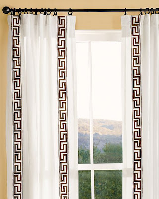
I still love Pottery Barn, however. Check out these fabulous greek key embroidery drapes!

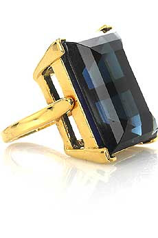
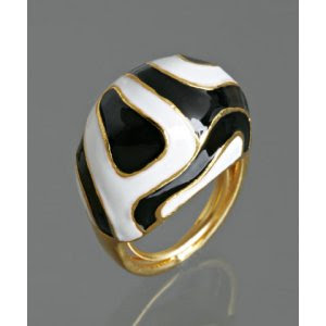
Obsession:Kenneth Jay Lane Cocktail Rings

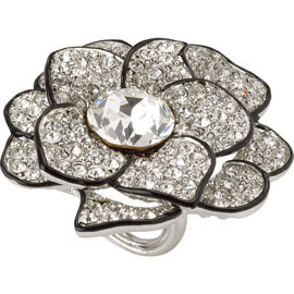
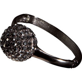
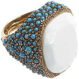
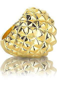
I have a pretty big obsession with cocktail rings. I think they are the finishing touch to any outfit. My absolute favorite cocktail rings are from the fabulous costume jeweler Kenneth Jay Lane. I love all of his jewelry, but especially his cocktail rings. They are definitely statement pieces but not at ridiculously large prices. The rings below run anywhere from $75-$200. You can view more rings at VivreNet-a-Porter, and Bloomingdales.


Jonathan Adler Blogs


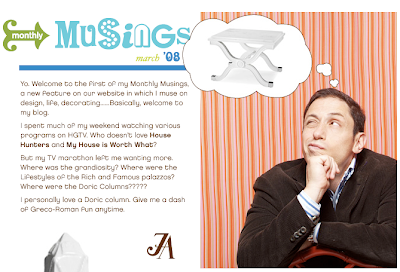
Happy chic designer Jonathan Adler has just started his own blog! Although he is only planning on blogging once a month, I'm still happy that Mr. Adler has decided to join the addictive blogging world. You can check out his monthly musings here.
Friday, March 21, 2008

Venfield Furniture

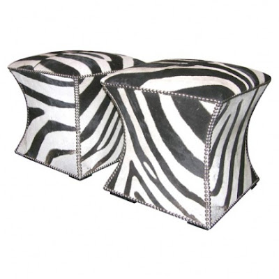
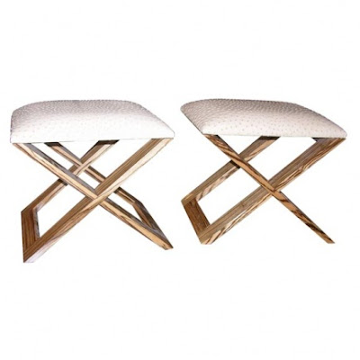
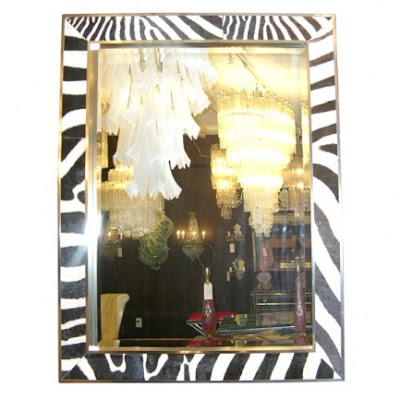
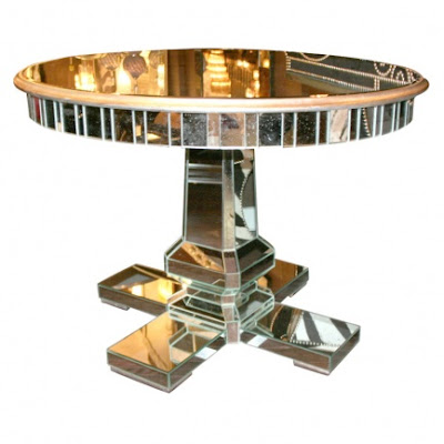
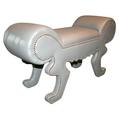
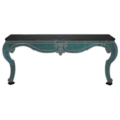
I would not mind having any one of the following custom pieces of furniture from the fabulous NYC store Venfield. Check out the website to see more amazing custom pieces. Be warned that no prices are listed, which normally means the item is very, very expensive!!

Pair of custom zebra cubes.


Pair of custom ostrich benches.


Framed zebra hide mirror.


Custom mirrored center hall table.


Custom grey leather bench with nickel nailheads.


And my favorite - Custom blue velvet console with black granite top. AMAZING!!!

Ulf Moritz Wallpaper


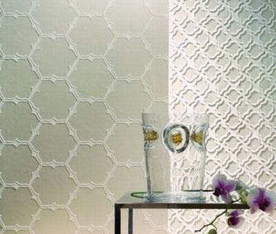
I recently went to get a pedicure at a very chic new place near my home. The place had chandeliers, Louis Ghost chairs, and a huge flat screen TV that played old movies. It was fabulous! I could not help but stare at the walls because I was obsessed with the wallpaper. I spoke with the owner, who happens to also be an interior designer, and she told me that the wallpaper was "Scala Divina" by Ulf Moritz. The picture above does not give this beautiful wallpaper any justice. In real life it has a sheer iridescent quality that is truly irresistible. I can't seem to find any U.S. outlets that sell this particular design but several British companies have it in stock. To order a sample from across the pond you can check it out here.
Tuesday, March 18, 2008

Mary McGee Interiors


I really love the look of this living room by L.A. designer Mary McGee. I own the white parsons desk from West Elm- which I love, but sometimes it can get a bit crowded. I never thought to use the West Elm parsons dining table as a desk. Genius! I love the contrast of the white table against the dark brown bookshelves. You know I love that zebra rug as well! The ultra modern Louis Ghost chairs are paired well with the antique armchair. I love mixing the old with the new. I think too much modern makes a place feel sterile.

I've included some more photos of this L.A. bungalow below and to see more you can check out the April issue of House Beautiful magazine. You should also take the time to check out Mary McGee's portfolio online. Her style is very glamorous, modern, and chic but classic at the same time. Apparently Mary will also be coming out with her own line of furniture soon, so be sure to stay tuned for that. I know I will!


Monday, March 17, 2008

Myles of Style


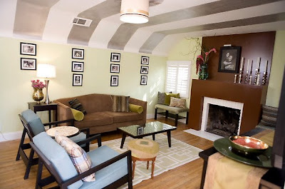
Did anyone catch the show Myles of Style Sunday night? I was super excited to watch it because I voted for Kim Myles when she was a contestant on Design Star. In the first episode of Myles of Style, Kim renewed a living room with her theme of "cottage chic." I gotta say that I was a little underwhelmed with the makeover. I think Kim did a fine job but it seemed a little boring to me.

I did like the idea of the metallic stripes on the ceiling but I don't know if I would get tired of them. I also liked the idea of putting that medallion sculpture on the ceiling, but I really hated that lamp shade. I thought it was way too small for the space. I loved the peacock color of the fabric used on the side chairs, but I can't get over the fact that the coffee table was designed with gold stickers. Stickers! I know it was a creative idea and all but it was just not my style. I'm hoping that the episodes to come are better than the one tonight. I'll give her a break since it was the very first episode :)
Thought I Should Spread the News


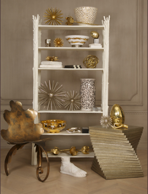
Browsing the always chic blog Life in a Venti Cup, I discovered that Kelly Wearstler's accessories collection forBergdorf Goodman is now available online. Mind you that the least expensive items will set you back several hundred dollars and perhaps several thousand, but should you have the requisite funds I believe that purchasing a part of Mrs. Wearstler's collection is a solid investment. I would not be surprised if her kaleidoscopes or classic Greek foot become collector's items one day.
Thursday, March 13, 2008

Ella Poe Jewelry


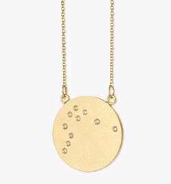
I'm not really into horoscopes but I am dying to have this constellation necklace from L.A. jewelry designer Ella Poe. I have a preference for the Aquarius design shown above but the necklace comes in all of the different zodiac signs. I just wish the price tag wasn't above the $1k mark!

Wednesday, March 12, 2008

Inspiration from Design Inc.


With the craziness of everyday life, I think it is really important to take some time to just stop and relax once in a while -whether it be a few minutes everyday or once a week for several hours. One way I relax is to spend time outdoors. Something about the fresh air, the sun, and the breeze helps me to totally zone out. I really wish I could have an outdoor space like the downtown deck pictured above.

This beautiful outdoor space was designed by the Canadian design team Design Inc. Design Inc. has been on HGTV Canada for four seasons and I only recently discovered that you can watch this amazing show on the Fine Living Channel Saturdays and Sundays at 7:30pm (hello Tivo!). Below are a few highlights of projects that have been featured on the show. You should definitely take some time and browse through the portfolio of rooms showcased online. There is so much inspiration!